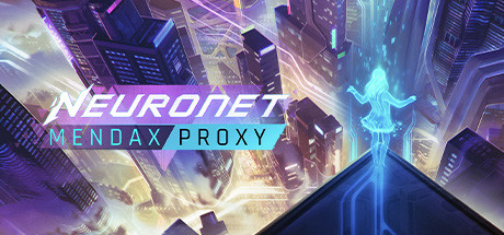
NeuroNet: Mendax Proxy puts the player in the shoes of Arc, an AI designed to manage the city of Catena. Through Arc’s journey, players visit a large number of locations and meet a diverse cast of characters. Each character has their own problems that need solving and ultimately players must make decisions using a simple Tinder-like interface where every choice impacts the balance of the city across 4 resources and the narrative path that the player will take.
This post gives a breakdown of my process across the development of the art for the characters, locations and UI that I developed.
CHARACTERS
Defining the visual feel of the game was a question of balance between our existing IP, NeuroNet’s character illustrations, and the specific needs of this new gameplay. Here the players spend all their time talking to these characters and, in a way, exploring the city they live in through a camera lens.
Having more stylised and graphical art was important to give the game a unique look. Additionally, it made it easier to produce a variety of different facial expressions to match the tone of the recorded dialogue.
 Comparing young Kyros from Mendax Proxy with old Kyros from NeuroSlicers
ENVIRONMENTS
NeuroNet: Mendax Proxy provided a nice opportunity to explore the different areas and moods of the city that you’re in charge of, Catena.
Narratively you’re looking at it from camera feeds, but it was important that the characters integrate nicely on top of the backgrounds, so I kept the camera around the eye level when I built the scenes in 3d, so the perspective we see in-game feels more natural.
[previewyoutube=BmwNve3S_4M;full][/previewyoutube]
Building all the environments in 3d was no small feat just to produce 2d illustrations, but it allowed us to get a more immersive and believable final result, along with some special effects for the transition between the camera feeds.
It was important as well that the aesthetic of the background relates harmoniously with one of the characters. For example, they couldn’t look too photorealistic, as the characters were stylised, the environments needed to have the same tone, so everything feels like belonging to the same universe. But the environments also needed to be more detailed and intricate to feel immersive, so I started to design all of them in 3d, before painting over them. This would allow the reuse of outlines and brush strokes to match the unique aesthetic of our character art and create visual harmony.

In NeuroNet: Mendax Proxy you’ll discover new areas of the city as you progress the narrative; from the underbelly of Catena with its Meta-Church to the private apartments of the richest corporate sharks.
If you play on mobile, you will have the choice between seeing more details on the character with your screen in portrait mode, or locations in landscape mode.
USER INTERFACE & BRANDING
The UI went through a few different iterations to build up the level of polish, with close to 500 concepts in the end. We needed to explore each useful variation on each element that could drive the look and feel of the game forward.
[previewyoutube=IWNJeq6wKCQ;full][/previewyoutube]
Development overview of the main UI systems in NeuroNet: Mendax Proxy.
The first element to tackle was the resource and swipe section, as it’s the element that players spend the most time looking at and interacting with. Firstly, it needed to allow the gameplay to be understood instinctively by new players, but also allow all players to read the information clearly and easily as they progressed. I avoided having the resource fill colour be inside the shape of the icon, as it was harder to read the current level, but instead make it contrast heavily by filling the whole background of the icon.
Initially, I judged that displaying the resources icons in black would be more visually striking. There was also consistency with the answers being this black box, as they are the two elements that represent the player.
It was an interesting point to push the visual identity of the game, experimenting with this contrast of black shapes on bright backgrounds, but I realized it did not help readability for each icon, which was more critical than style.
I avoided colour-coding the four resources, even if it helped to identify them. It wasn’t worth it given how much multiple colours weakened the overall visual style.
After balancing everything and exploring different directions, we found the best compromises between each idea, usability and style constraints.
The final UI has this overall dark blue background, and key elements are highlighted with this bright blue colour ramp. Even more important elements that demand immediate attention, like gameplay impact on the resources, are highlighted in bright orange, which still contrasts over the bright blue colour.
For polish, everything received a subtle circuit texture treatment that’s slightly organic. This follows the slightly neuromorphic take on the AI and environment design, mixing circuits, hard angles and lines, with curved bevel and overall smooth look.
[previewyoutube=p-fZU64MZO4;full][/previewyoutube]
Evolution of the main UI screen where most of the gameplay happens.
Thanks for reading. If you have any questions about the processes I used or just want to chat about the game then head over to our discord server at www.discord.gg/neuroslicers
Loic Bramoulle, Art Director
DREAM HARVEST GAMES
